CLOSE
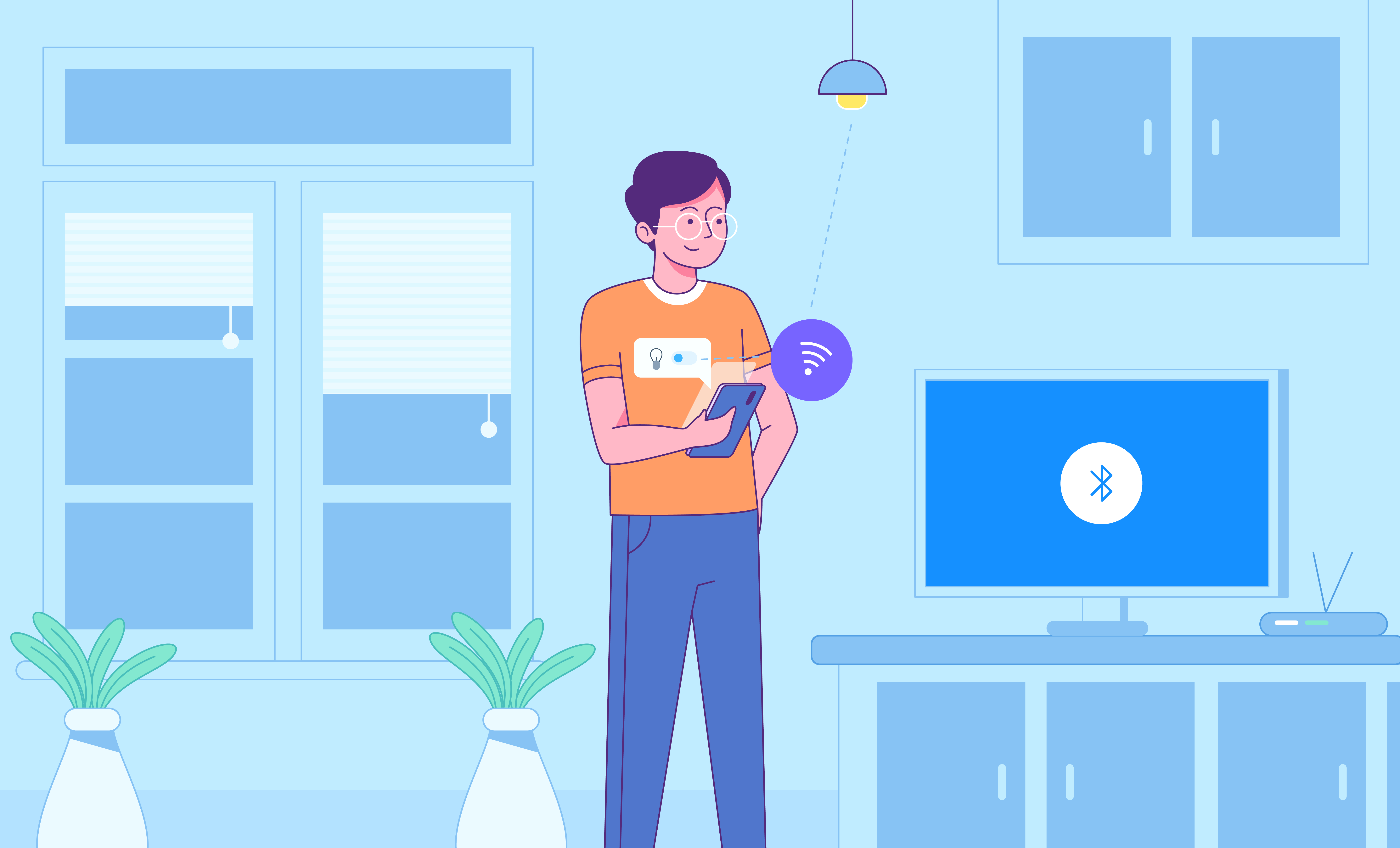
Smart home devices aim to make users’ lives easier but in reality the fragmented state of the current market actually accomplishes quite the opposite. Our goal was to design an integrated platform that allows users to manage their smart home devices with just one app, easily and effectively. Basically we needed to design a ‘fictional app’ that will control any type of smart home device i.e. Nest, Philips Hue, SmartLock, etc. by using a single interface.
I helped design an app that controls all smart home devices (Nest, Philips Hue, SmartLock, etc.) using a single interface. We researched the domain and interviewed potential users. We learned that there were three main areas that needed to be dealt with; control, cost, and convenience. We then built a product that would meet their needs in these three areas, whilst being fun to work with and very user friendly.
Beginning with a concept, our goal was to create a functional solution that’s visually appealing, easy to use and highly functional. We wanted to make the user experience for device setup simple with short and clear prompts. Based on the initial discussions and available information, we moved ahead with the following approach:
The first step was domain research. We looked up to the existing ecosystem and interviewed potential users. Our research gave us important insights into the critical factors for the success of such a solution. They were:
We focused on building a product that would stand strong on all these three areas while being user-friendly
User needs an easy and cohesive way to control all the digital devices in their home because the separate control systems are currently hard to keep track of and can be difficult to use.
Based on the research insights, we thought of developing user personas for developing a user-centric design process.
The research and interviews helped in creating two dedicated user personas with different aspirations regarding such a product.
The primary persona, Alice Rivera, a working mother, is curious and interested in technology that could help simplify her life. But based on her previous app using experience, she is also anxious about setup process and initial usage.
The secondary persona, Russell Abrams is a tech hobbyist. He struggles to manage the apps that connect to his multiple devices. He also hosts friends a lot so wants to always provide a comfortable environment for all.
We believed the above two to be the ideal user and our targeted audience for all future actions.
Matching our personas with research insights, we identified six major design principles. These principles served as the focal point for all design decisions:
Once the planning and principles part were in place, the team worked aggressively towards building the preliminary prototype.
At this stage, user experience was given high priority.Instead of taking a standardized visual approach, different visual approaches were tested. For instance, to ensure smooth navigational flow, bottom bar, fly out menu and a hybrid of both were tested.
Based on continuous testing and iteration, the following takeaways were documented for UI design:
Based on the prototype takeaways, four different style tiles were proposed. This was to potentially test the usability, ease and aesthetic appeal.
The following style tiles were created with different visual appearance:
All the four style tiles had a different ‘look and feel’ to test the appeal quotient among the real users.
All the versions of the prototype were put to usability testing. Testers were able to complete required tasks with ease and efficiency. According to testers, the prototype was ‘very straightforward and clear’.
Minor tweaks were made based on observations including the information displayed in energy reports, size of buttons and sliders and adding an option to display current vs set temperature for cooling/heating devices.
Once the prototype was put in a great shape, the process of visual testing kicked in. The visual testing process offered the following observations for further improvements:
After spending an extensive amount of time testing the app,a final prototype was delivered. The prototype was finalized based on the user likability and favorable ratings.
We toned down the intensity of the contrast after understanding that users liked a dark theme. Building a ‘Frankenstein’ version of all the style tiles by combining best UI elements from each prototype. The following decisions and observations were critical part of the finalization process:
The final protoype for the entire concept came in the form of an appealing and data-backed design form which included a dark background with a softened color scheme.
We outlined two basic attributes of the refined visual appeal
1. Hybrid/combined nav bar and hamburger menu
2. Visible status controls
The design elements and the UI/UX were later reflected in the product’s landing page too.